Newsletter Design Guide: Layout, Accessibility, Mobile QA, and Examples (2026)
Design readable email newsletters with clear hierarchy, responsive layout, accessible typography, image discipline, dark-mode checks, client testing, and reusable sections.

Newsletter design is the invisible architecture that determines whether subscribers read your content or delete it. A well-designed newsletter guides the eye naturally from headline to content to action. A poorly designed one creates visual chaos that drives readers away, regardless of how valuable the content is.
The good news: effective newsletter design does not require a professional designer. It requires understanding a few core principles and applying them consistently. This guide covers the layout strategies, typography rules, and visual techniques that make newsletters engaging and readable.
Four Templates, Running
Everything below this section is a claim about layout, and claims about layout are cheap. So here are four newsletters, running.
Each one is in a frame at a real width, showing its own HTML. Drag the width to 375 px and watch which columns stack and which refuse to. The panels follow whichever theme you are reading this page in — in dark mode you are looking at each template's own dark block, not an approximation of one. The source is under each panel.
Four layouts, running
Every panel below is the template's own email HTML in a frame at a real width. Drag the width down to 375 px and watch the columns stack.
Following your theme — switch it in the header to see the other one.
Read the HTML for The Letter
<!DOCTYPE html>
<html lang="en" dir="ltr">
<head>
<meta charset="utf-8">
<meta name="viewport" content="width=device-width, initial-scale=1">
<meta name="color-scheme" content="light dark">
<meta name="supported-color-schemes" content="light dark">
<title>The Letter</title>
<style>
body { margin:0; padding:0; width:100% !important; -webkit-text-size-adjust:100%; -ms-text-size-adjust:100%; }
table { border-collapse:collapse; mso-table-lspace:0pt; mso-table-rspace:0pt; }
img { border:0; outline:none; line-height:100%; -ms-interpolation-mode:bicubic; display:block; }
a { text-decoration:underline; }
@media only screen and (max-width:620px) {
.wrap { width:100% !important; }
.stack { display:block !important; width:100% !important; max-width:100% !important; }
.gutter { padding-left:20px !important; padding-right:20px !important; }
.cta { display:block !important; width:100% !important; box-sizing:border-box !important; text-align:center !important; }
.h1 { font-size:26px !important; line-height:32px !important; }
.thumb { width:100% !important; height:auto !important; max-width:100% !important; }
/* A digest row is the one two-column layout that should NOT stack: the
thumbnail shrinks and stays beside the headline, because a roundup is
read by scanning and a full-width decorative image per story destroys
that. */
.row-thumb { width:80px !important; }
.row-thumb img { width:80px !important; height:80px !important; }
.hide-sm { display:none !important; }
}
@media (prefers-color-scheme: dark) {
.d-bg { background-color:#151515 !important; }
.d-card { background-color:#1c1c1c !important; }
.d-ink { color:#f2f2f2 !important; }
.d-mute { color:#a8a8a8 !important; }
.d-rule { border-color:#3a3a3a !important; }
}
</style>
</head>
<body class="d-bg" style="margin:0;padding:0;background-color:#f0efec;">
<span style="display:none;font-size:1px;color:#fefefe;line-height:1px;max-height:0;max-width:0;opacity:0;overflow:hidden;">The pull quote you keep in your notes app is doing more work than your content calendar.</span><span style="display:none;font-size:1px;color:#fefefe;"> ͏ ͏ ͏ ͏ ͏</span>
<table role="presentation" cellpadding="0" cellspacing="0" border="0" width="100%" class="d-bg" style="background-color:#f0efec;">
<tr><td align="center" style="padding:32px 12px;">
<table role="presentation" cellpadding="0" cellspacing="0" border="0" width="600" class="wrap d-card" style="width:600px;max-width:600px;background-color:#ffffff;">
<tr><td style="padding:0;">
<img src="/_astro/letter-masthead.BcPkHvz4.png" width="600" height="250" alt="Meridian Press masthead: concentric blue arcs crossed by a diagonal band" style="width:100%;height:auto;max-width:600px;">
</td></tr>
<tr><td class="gutter" style="padding:36px 88px 0 88px;font-family:'Helvetica Neue',Helvetica,Arial,sans-serif;">
<p class="d-mute" style="margin:0 0 6px 0;font-size:13px;line-height:18px;letter-spacing:.08em;text-transform:uppercase;color:#6b6b6b;">Meridian Press · Issue 47</p>
</td></tr>
<tr><td class="gutter" style="padding:0 88px;font-family:Georgia,'Times New Roman',Times,serif;">
<h1 class="h1 d-ink" style="margin:0 0 20px 0;font-size:34px;line-height:42px;font-weight:400;color:#141414;">The archive is the product</h1>
<p class="d-ink" style="margin:0 0 20px 0;font-size:18px;line-height:30px;color:#242424;">Three weeks ago I went looking for something I wrote in 2019 and could not find it. Not on the site, not in the export, not in the platform's own search. Twelve hundred issues, and the only working index was my memory.</p>
<p class="d-ink" style="margin:0 0 20px 0;font-size:18px;line-height:30px;color:#242424;">That is the part nobody tells you about running a newsletter for six years. The sending is easy. The keeping is not.</p>
</td></tr>
<tr><td class="gutter" style="padding:8px 88px 28px 88px;">
<table role="presentation" cellpadding="0" cellspacing="0" border="0" width="100%">
<tr><td class="quote" style="border-left:3px solid #0084d1;padding:4px 0 4px 0;padding-left:20px;font-family:Georgia,'Times New Roman',Times,serif;">
<p class="d-ink" style="margin:0;font-size:19px;line-height:30px;font-style:italic;color:#141414;">Everything you publish is a deposit. Almost nobody builds the withdrawal.</p>
</td></tr>
</table>
</td></tr>
<tr><td class="gutter" style="padding:0 88px;font-family:Georgia,'Times New Roman',Times,serif;">
<p class="d-ink" style="margin:0 0 20px 0;font-size:18px;line-height:30px;color:#242424;">So this week I rebuilt the back catalogue as a real archive, with tags, full text search, and permanent URLs. It took nine days. Subscriber growth did not move. Time on site tripled.</p>
<p class="d-ink" style="margin:0 0 28px 0;font-size:18px;line-height:30px;color:#242424;">The whole thing is below, including the parts that did not work.</p>
</td></tr>
<tr><td class="gutter" style="padding:0 88px 36px 88px;font-family:'Helvetica Neue',Helvetica,Arial,sans-serif;">
<a href="https://example.com" style="font-size:17px;line-height:24px;font-weight:600;color:#0084d1;text-decoration:underline;">Read the whole issue →</a>
</td></tr>
<tr><td class="gutter d-rule" style="padding:0 88px;border-top:1px solid #e4e2de;"></td></tr>
<tr><td class="gutter" style="padding:24px 88px 40px 88px;font-family:'Helvetica Neue',Helvetica,Arial,sans-serif;">
<p class="d-mute" style="margin:0 0 10px 0;font-size:14px;line-height:22px;color:#6b6b6b;">Written by hand every Thursday. Reply and I read it.</p>
<p class="d-mute" style="margin:0;font-size:13px;line-height:20px;color:#8a8a8a;">Meridian Press, 14 Harbour Lane, Bristol BS1 4TT<br>
<a href="https://example.com" class="d-mute" style="color:#8a8a8a;">Unsubscribe</a> · <a href="https://example.com" class="d-mute" style="color:#8a8a8a;">View in browser</a></p>
</td></tr>
</table>
</td></tr>
</table>
</body>
</html>Following your theme — switch it in the header to see the other one.
Read the HTML for The Digest
<!DOCTYPE html>
<html lang="en" dir="ltr">
<head>
<meta charset="utf-8">
<meta name="viewport" content="width=device-width, initial-scale=1">
<meta name="color-scheme" content="light dark">
<meta name="supported-color-schemes" content="light dark">
<title>The Digest</title>
<style>
body { margin:0; padding:0; width:100% !important; -webkit-text-size-adjust:100%; -ms-text-size-adjust:100%; }
table { border-collapse:collapse; mso-table-lspace:0pt; mso-table-rspace:0pt; }
img { border:0; outline:none; line-height:100%; -ms-interpolation-mode:bicubic; display:block; }
a { text-decoration:underline; }
@media only screen and (max-width:620px) {
.wrap { width:100% !important; }
.stack { display:block !important; width:100% !important; max-width:100% !important; }
.gutter { padding-left:20px !important; padding-right:20px !important; }
.cta { display:block !important; width:100% !important; box-sizing:border-box !important; text-align:center !important; }
.h1 { font-size:26px !important; line-height:32px !important; }
.thumb { width:100% !important; height:auto !important; max-width:100% !important; }
/* A digest row is the one two-column layout that should NOT stack: the
thumbnail shrinks and stays beside the headline, because a roundup is
read by scanning and a full-width decorative image per story destroys
that. */
.row-thumb { width:80px !important; }
.row-thumb img { width:80px !important; height:80px !important; }
.hide-sm { display:none !important; }
}
@media (prefers-color-scheme: dark) {
.d-bg { background-color:#131313 !important; }
.d-card { background-color:#1b1b1b !important; }
.d-ink { color:#f3f3f3 !important; }
.d-mute { color:#a5a5a5 !important; }
.d-rule { border-color:#333333 !important; }
.d-chip { background-color:#10352f !important; color:#7fd8c6 !important; }
}
</style>
</head>
<body class="d-bg" style="margin:0;padding:0;background-color:#f4f3f0;">
<span style="display:none;font-size:1px;color:#fefefe;line-height:1px;max-height:0;max-width:0;opacity:0;overflow:hidden;">Six things worth your Tuesday. Two of them are about pricing.</span><span style="display:none;font-size:1px;color:#fefefe;"> ͏ ͏ ͏ ͏ ͏</span>
<table role="presentation" cellpadding="0" cellspacing="0" border="0" width="100%" class="d-bg" style="background-color:#f4f3f0;">
<tr><td align="center" style="padding:28px 12px;">
<table role="presentation" cellpadding="0" cellspacing="0" border="0" width="600" class="wrap d-card" style="width:600px;max-width:600px;background-color:#ffffff;border-radius:6px;">
<tr><td class="gutter" style="padding:30px 32px 22px 32px;font-family:'Helvetica Neue',Helvetica,Arial,sans-serif;">
<table role="presentation" width="100%" cellpadding="0" cellspacing="0" border="0">
<tr>
<td valign="middle" style="font-family:'Helvetica Neue',Helvetica,Arial,sans-serif;">
<p class="d-ink" style="margin:0;font-size:20px;line-height:26px;font-weight:800;color:#141414;">The Tuesday Digest</p>
<p class="d-mute" style="margin:4px 0 0 0;font-size:14px;line-height:20px;color:#6b6b6b;">26 August 2026 · 6 items · 9 min</p>
</td>
<td valign="middle" align="right" class="hide-sm">
<span class="d-chip" style="display:inline-block;background:#e2f4ef;color:#00614f;border-radius:999px;font-family:'Helvetica Neue',Helvetica,Arial,sans-serif;font-size:12px;font-weight:700;padding:6px 12px;">ISSUE 212</span>
</td>
</tr>
</table>
</td></tr>
<tr><td class="gutter" style="padding:0 32px;"><table role="presentation" width="100%" cellpadding="0" cellspacing="0" border="0"><tr><td class="d-rule" style="border-top:2px solid #141414;font-size:0;line-height:0;"> </td></tr></table></td></tr>
<tr><td class="gutter" style="padding:0 32px;">
<table role="presentation" cellpadding="0" cellspacing="0" border="0" width="100%" style="padding:22px 0;">
<tr>
<td class="row-thumb" width="112" valign="top" style="width:112px;padding:0;padding-right:20px;">
<img src="/_astro/digest-1.gDWNYw1C.png" width="112" height="112" alt="Abstract teal arcs crossed by a diagonal band" style="width:112px;height:112px;border-radius:4px;">
</td>
<td valign="top" style="font-family:'Helvetica Neue',Helvetica,Arial,sans-serif;">
<p class="d-mute" style="margin:0 0 6px 0;font-size:12px;line-height:16px;letter-spacing:.06em;text-transform:uppercase;color:#007d6a;">01 · PRICING</p>
<p style="margin:0 0 6px 0;font-size:18px;line-height:26px;font-weight:700;">
<a href="https://example.com" class="d-ink" style="color:#141414;text-decoration:none;">Three companies moved to usage pricing and two moved back</a>
</p>
<p class="d-mute" style="margin:0;font-size:16px;line-height:26px;color:#555555;">The two that reverted both said the same thing: support load went up before revenue did.</p>
</td>
</tr>
</table>
</td></tr>
<tr><td class="gutter" style="padding:0 32px;"><table role="presentation" width="100%" cellpadding="0" cellspacing="0" border="0"><tr><td class="d-rule" style="border-top:1px solid #eceae6;font-size:0;line-height:0;"> </td></tr></table></td></tr>
<tr><td class="gutter" style="padding:0 32px;">
<table role="presentation" cellpadding="0" cellspacing="0" border="0" width="100%" style="padding:22px 0;">
<tr>
<td class="row-thumb" width="112" valign="top" style="width:112px;padding:0;padding-right:20px;">
<img src="/_astro/digest-2.ch7Avmad.png" width="112" height="112" alt="Abstract teal rings with an offset focal dot" style="width:112px;height:112px;border-radius:4px;">
</td>
<td valign="top" style="font-family:'Helvetica Neue',Helvetica,Arial,sans-serif;">
<p class="d-mute" style="margin:0 0 6px 0;font-size:12px;line-height:16px;letter-spacing:.06em;text-transform:uppercase;color:#007d6a;">02 · DELIVERABILITY</p>
<p style="margin:0 0 6px 0;font-size:18px;line-height:26px;font-weight:700;">
<a href="https://example.com" class="d-ink" style="color:#141414;text-decoration:none;">Gmail's bulk sender rules are a year old. Here is what actually changed</a>
</p>
<p class="d-mute" style="margin:0;font-size:16px;line-height:26px;color:#555555;">Complaint rate is the only threshold anyone got close to. The rest was already table stakes.</p>
</td>
</tr>
</table>
</td></tr>
<tr><td class="gutter" style="padding:0 32px;"><table role="presentation" width="100%" cellpadding="0" cellspacing="0" border="0"><tr><td class="d-rule" style="border-top:1px solid #eceae6;font-size:0;line-height:0;"> </td></tr></table></td></tr>
<tr><td class="gutter" style="padding:0 32px;">
<table role="presentation" cellpadding="0" cellspacing="0" border="0" width="100%" style="padding:22px 0;">
<tr>
<td class="row-thumb" width="112" valign="top" style="width:112px;padding:0;padding-right:20px;">
<img src="/_astro/digest-3.DP0eG3wj.png" width="112" height="112" alt="Abstract teal concentric arcs on an off-white ground" style="width:112px;height:112px;border-radius:4px;">
</td>
<td valign="top" style="font-family:'Helvetica Neue',Helvetica,Arial,sans-serif;">
<p class="d-mute" style="margin:0 0 6px 0;font-size:12px;line-height:16px;letter-spacing:.06em;text-transform:uppercase;color:#007d6a;">03 · CRAFT</p>
<p style="margin:0 0 6px 0;font-size:18px;line-height:26px;font-weight:700;">
<a href="https://example.com" class="d-ink" style="color:#141414;text-decoration:none;">A newsletter archive is a search product, not a list of links</a>
</p>
<p class="d-mute" style="margin:0;font-size:16px;line-height:26px;color:#555555;">Nine days of work, no subscriber growth, triple the time on site. The tradeoff is the interesting part.</p>
</td>
</tr>
</table>
</td></tr>
<tr><td class="gutter" style="padding:0 32px;"><table role="presentation" width="100%" cellpadding="0" cellspacing="0" border="0"><tr><td class="d-rule" style="border-top:1px solid #eceae6;font-size:0;line-height:0;"> </td></tr></table></td></tr>
<tr><td class="gutter" style="padding:24px 32px 34px 32px;font-family:'Helvetica Neue',Helvetica,Arial,sans-serif;">
<p class="d-mute" style="margin:0 0 14px 0;font-size:15px;line-height:24px;color:#555555;">Three more below the fold, including the one about invoicing that everyone replies to.</p>
<!--[if mso]><table role="presentation" cellpadding="0" cellspacing="0" border="0"><tr><td bgcolor="#007d6a" style="border-radius:4px;"><![endif]-->
<a href="https://example.com" class="cta" style="background:#007d6a;border-radius:4px;color:#ffffff;display:inline-block;font-family:'Helvetica Neue',Helvetica,Arial,sans-serif;font-size:16px;font-weight:600;line-height:20px;padding:14px 28px;text-align:center;text-decoration:none;mso-padding-alt:0;">Read all six</a>
<!--[if mso]></td></tr></table><![endif]-->
</td></tr>
<tr><td class="gutter d-rule" style="padding:0 32px;border-top:1px solid #eceae6;"></td></tr>
<tr><td class="gutter" style="padding:20px 32px 30px 32px;font-family:'Helvetica Neue',Helvetica,Arial,sans-serif;">
<p class="d-mute" style="margin:0;font-size:13px;line-height:20px;color:#8a8a8a;">The Tuesday Digest, 9 Fitzroy Street, Manchester M1 2AL<br>
<a href="https://example.com" class="d-mute" style="color:#8a8a8a;">Unsubscribe</a> · <a href="https://example.com" class="d-mute" style="color:#8a8a8a;">Manage preferences</a> · <a href="https://example.com" class="d-mute" style="color:#8a8a8a;">View in browser</a></p>
</td></tr>
</table>
</td></tr>
</table>
</body>
</html>Following your theme — switch it in the header to see the other one.
Read the HTML for The Storefront
<!DOCTYPE html>
<html lang="en" dir="ltr">
<head>
<meta charset="utf-8">
<meta name="viewport" content="width=device-width, initial-scale=1">
<meta name="color-scheme" content="light dark">
<meta name="supported-color-schemes" content="light dark">
<title>The Storefront</title>
<style>
body { margin:0; padding:0; width:100% !important; -webkit-text-size-adjust:100%; -ms-text-size-adjust:100%; }
table { border-collapse:collapse; mso-table-lspace:0pt; mso-table-rspace:0pt; }
img { border:0; outline:none; line-height:100%; -ms-interpolation-mode:bicubic; display:block; }
a { text-decoration:underline; }
@media only screen and (max-width:620px) {
.wrap { width:100% !important; }
.stack { display:block !important; width:100% !important; max-width:100% !important; }
.gutter { padding-left:20px !important; padding-right:20px !important; }
.cta { display:block !important; width:100% !important; box-sizing:border-box !important; text-align:center !important; }
.h1 { font-size:26px !important; line-height:32px !important; }
.thumb { width:100% !important; height:auto !important; max-width:100% !important; }
/* A digest row is the one two-column layout that should NOT stack: the
thumbnail shrinks and stays beside the headline, because a roundup is
read by scanning and a full-width decorative image per story destroys
that. */
.row-thumb { width:80px !important; }
.row-thumb img { width:80px !important; height:80px !important; }
.hide-sm { display:none !important; }
}
@media (prefers-color-scheme: dark) {
.d-bg { background-color:#141210 !important; }
.d-card { background-color:#1d1a18 !important; }
.d-ink { color:#f5f2ef !important; }
.d-mute { color:#aaa39d !important; }
.d-rule { border-color:#38322d !important; }
.d-tile { background-color:#241f1c !important; }
}
</style>
</head>
<body class="d-bg" style="margin:0;padding:0;background-color:#efece8;">
<span style="display:none;font-size:1px;color:#fefefe;line-height:1px;max-height:0;max-width:0;opacity:0;overflow:hidden;">Four new prints. The harbour one is 40 copies and it will not last the week.</span><span style="display:none;font-size:1px;color:#fefefe;"> ͏ ͏ ͏ ͏ ͏</span>
<table role="presentation" cellpadding="0" cellspacing="0" border="0" width="100%" class="d-bg" style="background-color:#efece8;">
<tr><td align="center" style="padding:24px 12px;">
<table role="presentation" cellpadding="0" cellspacing="0" border="0" width="600" class="wrap d-card" style="width:600px;max-width:600px;background-color:#ffffff;">
<tr><td class="gutter" style="padding:22px 24px;font-family:'Helvetica Neue',Helvetica,Arial,sans-serif;">
<table role="presentation" width="100%" cellpadding="0" cellspacing="0" border="0"><tr>
<td class="d-ink" style="font-size:17px;line-height:22px;font-weight:800;letter-spacing:.14em;text-transform:uppercase;color:#141414;">Northlight</td>
<td align="right" class="d-mute hide-sm" style="font-family:'Helvetica Neue',Helvetica,Arial,sans-serif;font-size:13px;line-height:20px;color:#6b6b6b;">Autumn drop · 04</td>
</tr></table>
</td></tr>
<tr><td style="padding:0;">
<img src="/_astro/shop-hero.r4mykM_E.png" width="600" height="360" alt="Four new Northlight prints: overlapping rust-red arcs on warm off-white" style="width:100%;height:auto;max-width:600px;">
</td></tr>
<tr><td class="gutter" style="padding:30px 40px 0 40px;font-family:'Helvetica Neue',Helvetica,Arial,sans-serif;">
<h1 class="h1 d-ink" style="margin:0 0 12px 0;font-size:30px;line-height:38px;font-weight:800;color:#141414;">Four prints. Forty copies each.</h1>
<p class="d-mute" style="margin:0 0 22px 0;font-size:16px;line-height:26px;color:#555555;">Every print in this drop is hand-pulled, numbered, and gone when it is gone. Nothing here gets reprinted.</p>
</td></tr>
<tr><td class="gutter" style="padding:0 40px 26px 40px;font-family:'Helvetica Neue',Helvetica,Arial,sans-serif;">
<!--[if mso]><table role="presentation" cellpadding="0" cellspacing="0" border="0"><tr><td bgcolor="#b8442d" style="border-radius:4px;"><![endif]-->
<a href="https://example.com" class="cta" style="background:#b8442d;border-radius:4px;color:#ffffff;display:inline-block;font-family:'Helvetica Neue',Helvetica,Arial,sans-serif;font-size:16px;font-weight:600;line-height:20px;padding:14px 28px;text-align:center;text-decoration:none;mso-padding-alt:0;">Shop the drop</a>
<!--[if mso]></td></tr></table><![endif]-->
</td></tr>
<tr><td class="gutter" style="padding:0 32px 8px 32px;">
<table role="presentation" cellpadding="0" cellspacing="0" border="0" width="100%">
<tr>
<td class="stack" width="50%" valign="top" style="width:50%;padding:0 8px 16px 8px;">
<table role="presentation" cellpadding="0" cellspacing="0" border="0" width="100%" class="d-tile" style="background-color:#faf9f7;border-radius:4px;">
<tr><td style="padding:0;"><img src="/_astro/shop-print-1.B7Z7OyM8.png" width="272" height="272" alt="Harbour, an abstract print in rust red" class="thumb" style="width:100%;height:auto;border-radius:4px 4px 0 0;"></td></tr>
<tr><td style="padding:16px 16px 18px 16px;font-family:'Helvetica Neue',Helvetica,Arial,sans-serif;">
<p class="d-ink" style="margin:0 0 2px 0;font-size:16px;line-height:22px;font-weight:700;color:#141414;">Harbour</p>
<p class="d-mute" style="margin:0 0 10px 0;font-size:14px;line-height:20px;color:#6b6b6b;">50 × 70 cm · giclée on cotton rag</p>
<p style="margin:0 0 14px 0;font-size:18px;line-height:24px;font-weight:700;color:#b8442d;">£85</p>
<!--[if mso]><table role="presentation" cellpadding="0" cellspacing="0" border="0"><tr><td bgcolor="#b8442d" style="border-radius:4px;"><![endif]-->
<a href="https://example.com" class="cta" style="background:#b8442d;border-radius:4px;color:#ffffff;display:inline-block;font-family:'Helvetica Neue',Helvetica,Arial,sans-serif;font-size:16px;font-weight:600;line-height:20px;padding:14px 28px;text-align:center;text-decoration:none;mso-padding-alt:0;">Add to basket</a>
<!--[if mso]></td></tr></table><![endif]-->
</td></tr>
</table>
</td>
<td class="stack" width="50%" valign="top" style="width:50%;padding:0 8px 16px 8px;">
<table role="presentation" cellpadding="0" cellspacing="0" border="0" width="100%" class="d-tile" style="background-color:#faf9f7;border-radius:4px;">
<tr><td style="padding:0;"><img src="/_astro/shop-print-2.CMBKLJ38.png" width="272" height="272" alt="Dusk, an abstract print in amber" class="thumb" style="width:100%;height:auto;border-radius:4px 4px 0 0;"></td></tr>
<tr><td style="padding:16px 16px 18px 16px;font-family:'Helvetica Neue',Helvetica,Arial,sans-serif;">
<p class="d-ink" style="margin:0 0 2px 0;font-size:16px;line-height:22px;font-weight:700;color:#141414;">Dusk</p>
<p class="d-mute" style="margin:0 0 10px 0;font-size:14px;line-height:20px;color:#6b6b6b;">50 × 70 cm · giclée on cotton rag</p>
<p style="margin:0 0 14px 0;font-size:18px;line-height:24px;font-weight:700;color:#b8442d;">£85</p>
<!--[if mso]><table role="presentation" cellpadding="0" cellspacing="0" border="0"><tr><td bgcolor="#b8442d" style="border-radius:4px;"><![endif]-->
<a href="https://example.com" class="cta" style="background:#b8442d;border-radius:4px;color:#ffffff;display:inline-block;font-family:'Helvetica Neue',Helvetica,Arial,sans-serif;font-size:16px;font-weight:600;line-height:20px;padding:14px 28px;text-align:center;text-decoration:none;mso-padding-alt:0;">Add to basket</a>
<!--[if mso]></td></tr></table><![endif]-->
</td></tr>
</table>
</td>
</tr>
<tr>
<td class="stack" width="50%" valign="top" style="width:50%;padding:0 8px 16px 8px;">
<table role="presentation" cellpadding="0" cellspacing="0" border="0" width="100%" class="d-tile" style="background-color:#faf9f7;border-radius:4px;">
<tr><td style="padding:0;"><img src="/_astro/shop-print-3.C9XLoBz6.png" width="272" height="272" alt="Tide, an abstract print in violet" class="thumb" style="width:100%;height:auto;border-radius:4px 4px 0 0;"></td></tr>
<tr><td style="padding:16px 16px 18px 16px;font-family:'Helvetica Neue',Helvetica,Arial,sans-serif;">
<p class="d-ink" style="margin:0 0 2px 0;font-size:16px;line-height:22px;font-weight:700;color:#141414;">Tide</p>
<p class="d-mute" style="margin:0 0 10px 0;font-size:14px;line-height:20px;color:#6b6b6b;">40 × 50 cm · giclée on cotton rag</p>
<p style="margin:0 0 14px 0;font-size:18px;line-height:24px;font-weight:700;color:#b8442d;">£65</p>
<!--[if mso]><table role="presentation" cellpadding="0" cellspacing="0" border="0"><tr><td bgcolor="#b8442d" style="border-radius:4px;"><![endif]-->
<a href="https://example.com" class="cta" style="background:#b8442d;border-radius:4px;color:#ffffff;display:inline-block;font-family:'Helvetica Neue',Helvetica,Arial,sans-serif;font-size:16px;font-weight:600;line-height:20px;padding:14px 28px;text-align:center;text-decoration:none;mso-padding-alt:0;">Add to basket</a>
<!--[if mso]></td></tr></table><![endif]-->
</td></tr>
</table>
</td>
<td class="stack" width="50%" valign="top" style="width:50%;padding:0 8px 16px 8px;">
<table role="presentation" cellpadding="0" cellspacing="0" border="0" width="100%" class="d-tile" style="background-color:#faf9f7;border-radius:4px;">
<tr><td style="padding:0;"><img src="/_astro/shop-print-4.jL_6WDwF.png" width="272" height="272" alt="Quarry, an abstract print in deep green" class="thumb" style="width:100%;height:auto;border-radius:4px 4px 0 0;"></td></tr>
<tr><td style="padding:16px 16px 18px 16px;font-family:'Helvetica Neue',Helvetica,Arial,sans-serif;">
<p class="d-ink" style="margin:0 0 2px 0;font-size:16px;line-height:22px;font-weight:700;color:#141414;">Quarry</p>
<p class="d-mute" style="margin:0 0 10px 0;font-size:14px;line-height:20px;color:#6b6b6b;">40 × 50 cm · giclée on cotton rag</p>
<p style="margin:0 0 14px 0;font-size:18px;line-height:24px;font-weight:700;color:#b8442d;">£65</p>
<!--[if mso]><table role="presentation" cellpadding="0" cellspacing="0" border="0"><tr><td bgcolor="#b8442d" style="border-radius:4px;"><![endif]-->
<a href="https://example.com" class="cta" style="background:#b8442d;border-radius:4px;color:#ffffff;display:inline-block;font-family:'Helvetica Neue',Helvetica,Arial,sans-serif;font-size:16px;font-weight:600;line-height:20px;padding:14px 28px;text-align:center;text-decoration:none;mso-padding-alt:0;">Add to basket</a>
<!--[if mso]></td></tr></table><![endif]-->
</td></tr>
</table>
</td>
</tr>
</table>
</td></tr>
<tr><td class="gutter" style="padding:6px 40px 30px 40px;font-family:'Helvetica Neue',Helvetica,Arial,sans-serif;">
<table role="presentation" width="100%" cellpadding="0" cellspacing="0" border="0" class="d-tile" style="background:#faf9f7;border-radius:4px;">
<tr><td style="padding:16px 20px;font-family:'Helvetica Neue',Helvetica,Arial,sans-serif;">
<p class="d-ink" style="margin:0;font-size:15px;line-height:24px;color:#242424;"><strong>Free UK shipping over £75.</strong> Framed options at checkout. Returns within 30 days, unframed.</p>
</td></tr>
</table>
</td></tr>
<tr><td class="gutter d-rule" style="padding:0 40px;border-top:1px solid #ebe7e2;"></td></tr>
<tr><td class="gutter" style="padding:20px 40px 30px 40px;font-family:'Helvetica Neue',Helvetica,Arial,sans-serif;">
<p class="d-mute" style="margin:0;font-size:13px;line-height:20px;color:#8a8a8a;">Northlight Print Co., Unit 4 Wharf Road, Leeds LS10 1JQ<br>
<a href="https://example.com" class="d-mute" style="color:#8a8a8a;">Unsubscribe</a> · <a href="https://example.com" class="d-mute" style="color:#8a8a8a;">View in browser</a></p>
</td></tr>
</table>
</td></tr>
</table>
</body>
</html>Following your theme — switch it in the header to see the other one.
Read the HTML for The Brief
<!DOCTYPE html>
<html lang="en" dir="ltr">
<head>
<meta charset="utf-8">
<meta name="viewport" content="width=device-width, initial-scale=1">
<meta name="color-scheme" content="light dark">
<meta name="supported-color-schemes" content="light dark">
<title>The Brief</title>
<style>
body { margin:0; padding:0; width:100% !important; -webkit-text-size-adjust:100%; -ms-text-size-adjust:100%; }
table { border-collapse:collapse; mso-table-lspace:0pt; mso-table-rspace:0pt; }
img { border:0; outline:none; line-height:100%; -ms-interpolation-mode:bicubic; display:block; }
a { text-decoration:underline; }
@media only screen and (max-width:620px) {
.wrap { width:100% !important; }
.stack { display:block !important; width:100% !important; max-width:100% !important; }
.gutter { padding-left:20px !important; padding-right:20px !important; }
.cta { display:block !important; width:100% !important; box-sizing:border-box !important; text-align:center !important; }
.h1 { font-size:26px !important; line-height:32px !important; }
.thumb { width:100% !important; height:auto !important; max-width:100% !important; }
/* A digest row is the one two-column layout that should NOT stack: the
thumbnail shrinks and stays beside the headline, because a roundup is
read by scanning and a full-width decorative image per story destroys
that. */
.row-thumb { width:80px !important; }
.row-thumb img { width:80px !important; height:80px !important; }
.hide-sm { display:none !important; }
}
@media (prefers-color-scheme: dark) {
.d-bg { background-color:#121212 !important; }
.d-card { background-color:#1a1a1a !important; }
.d-ink { color:#f2f2f2 !important; }
.d-mute { color:#a6a6a6 !important; }
.d-rule { border-color:#333333 !important; }
.d-tile { background-color:#232323 !important; }
.d-track { background-color:#2c2c2c !important; }
}
</style>
</head>
<body class="d-bg" style="margin:0;padding:0;background-color:#f1f0f4;">
<span style="display:none;font-size:1px;color:#fefefe;line-height:1px;max-height:0;max-width:0;opacity:0;overflow:hidden;">Reply rate is up 4 points and we still do not know why. Best guess inside.</span><span style="display:none;font-size:1px;color:#fefefe;"> ͏ ͏ ͏ ͏ ͏</span>
<table role="presentation" cellpadding="0" cellspacing="0" border="0" width="100%" class="d-bg" style="background-color:#f1f0f4;">
<tr><td align="center" style="padding:26px 12px;">
<table role="presentation" cellpadding="0" cellspacing="0" border="0" width="600" class="wrap d-card" style="width:600px;max-width:600px;background-color:#ffffff;border-radius:6px;">
<tr><td style="padding:0;background:#141414;border-radius:6px 6px 0 0;">
<img src="/_astro/brief-band.CsaAK-Uv.png" width="600" height="150" alt="Ledger Weekly masthead: violet arcs on near-black" style="width:100%;height:auto;max-width:600px;border-radius:6px 6px 0 0;">
</td></tr>
<tr><td class="gutter" style="padding:26px 32px 18px 32px;font-family:'Helvetica Neue',Helvetica,Arial,sans-serif;">
<p style="margin:0 0 4px 0;font-size:12px;line-height:16px;letter-spacing:.1em;text-transform:uppercase;color:#8f83ff;">Ledger Weekly · Week 35</p>
<h1 class="h1 d-ink" style="margin:0;font-size:26px;line-height:34px;font-weight:800;color:#141414;">Reply rate moved and nobody shipped anything</h1>
</td></tr>
<tr><td class="gutter" style="padding:0 26px 8px 26px;">
<table role="presentation" width="100%" cellpadding="0" cellspacing="0" border="0"><tr>
<td class="stack" width="33.33%" valign="top" style="width:33.33%;padding:0 6px;">
<table role="presentation" width="100%" cellpadding="0" cellspacing="0" border="0" class="d-tile" style="background:#f6f5f8;border-radius:4px;">
<tr><td style="padding:18px 16px;font-family:'Helvetica Neue',Helvetica,Arial,sans-serif;">
<p class="d-ink" style="margin:0 0 2px 0;font-size:30px;line-height:36px;font-weight:800;color:#141414;">31.4%</p>
<p class="d-mute" style="margin:0 0 6px 0;font-size:13px;line-height:18px;color:#6b6b6b;">Open rate</p>
<p style="margin:0;font-size:13px;line-height:18px;font-weight:700;color:#007d6a;">▲ 1.2 pts</p>
</td></tr>
</table>
</td>
<td class="stack" width="33.33%" valign="top" style="width:33.33%;padding:0 6px;">
<table role="presentation" width="100%" cellpadding="0" cellspacing="0" border="0" class="d-tile" style="background:#f6f5f8;border-radius:4px;">
<tr><td style="padding:18px 16px;font-family:'Helvetica Neue',Helvetica,Arial,sans-serif;">
<p class="d-ink" style="margin:0 0 2px 0;font-size:30px;line-height:36px;font-weight:800;color:#141414;">8.9%</p>
<p class="d-mute" style="margin:0 0 6px 0;font-size:13px;line-height:18px;color:#6b6b6b;">Click rate</p>
<p style="margin:0;font-size:13px;line-height:18px;font-weight:700;color:#b8442d;">▼ 0.4 pts</p>
</td></tr>
</table>
</td>
<td class="stack" width="33.33%" valign="top" style="width:33.33%;padding:0 6px;">
<table role="presentation" width="100%" cellpadding="0" cellspacing="0" border="0" class="d-tile" style="background:#f6f5f8;border-radius:4px;">
<tr><td style="padding:18px 16px;font-family:'Helvetica Neue',Helvetica,Arial,sans-serif;">
<p class="d-ink" style="margin:0 0 2px 0;font-size:30px;line-height:36px;font-weight:800;color:#141414;">6.1%</p>
<p class="d-mute" style="margin:0 0 6px 0;font-size:13px;line-height:18px;color:#6b6b6b;">Reply rate</p>
<p style="margin:0;font-size:13px;line-height:18px;font-weight:700;color:#007d6a;">▲ 4.0 pts</p>
</td></tr>
</table>
</td>
</tr></table>
</td></tr>
<tr><td class="gutter" style="padding:20px 32px 0 32px;font-family:'Helvetica Neue',Helvetica,Arial,sans-serif;">
<p class="d-ink" style="margin:0 0 18px 0;font-size:16px;line-height:26px;color:#242424;">Nothing changed in the send. Same list, same Thursday, same template. The only variable we can find is that the subject line asked a question for the first time in eleven issues.</p>
<p class="d-mute" style="margin:0 0 10px 0;font-size:12px;line-height:16px;letter-spacing:.08em;text-transform:uppercase;color:#6b6b6b;">Replies by segment</p>
</td></tr>
<tr><td class="gutter" style="padding:0 32px 22px 32px;">
<table role="presentation" class="chart" width="100%" cellpadding="0" cellspacing="0" border="0">
<tr>
<td width="150" valign="middle" class="d-ink" style="width:150px;padding:7px 0;padding-right:12px;font-family:'Helvetica Neue',Helvetica,Arial,sans-serif;font-size:15px;line-height:20px;color:#242424;">Paid subscribers</td>
<td valign="middle" style="padding:7px 0;">
<table role="presentation" width="100%" cellpadding="0" cellspacing="0" border="0" class="d-track" style="background:#ebe9f2;border-radius:2px;">
<tr><td width="100%" style="width:100%;background:#8f83ff;border-radius:2px;font-size:0;line-height:0;height:18px;"> </td><td style="font-size:0;line-height:0;"> </td></tr>
</table>
</td>
<td width="64" align="right" valign="middle" class="d-mute" style="width:64px;padding:7px 0;padding-left:12px;font-family:'Helvetica Neue',Helvetica,Arial,sans-serif;font-size:14px;line-height:20px;font-weight:700;color:#555555;">11.2%</td>
</tr>
<tr>
<td width="150" valign="middle" class="d-ink" style="width:150px;padding:7px 0;padding-right:12px;font-family:'Helvetica Neue',Helvetica,Arial,sans-serif;font-size:15px;line-height:20px;color:#242424;">Free, active 90d</td>
<td valign="middle" style="padding:7px 0;">
<table role="presentation" width="100%" cellpadding="0" cellspacing="0" border="0" class="d-track" style="background:#ebe9f2;border-radius:2px;">
<tr><td width="57%" style="width:57%;background:#8f83ff;border-radius:2px;font-size:0;line-height:0;height:18px;"> </td><td style="font-size:0;line-height:0;"> </td></tr>
</table>
</td>
<td width="64" align="right" valign="middle" class="d-mute" style="width:64px;padding:7px 0;padding-left:12px;font-family:'Helvetica Neue',Helvetica,Arial,sans-serif;font-size:14px;line-height:20px;font-weight:700;color:#555555;">6.4%</td>
</tr>
<tr>
<td width="150" valign="middle" class="d-ink" style="width:150px;padding:7px 0;padding-right:12px;font-family:'Helvetica Neue',Helvetica,Arial,sans-serif;font-size:15px;line-height:20px;color:#242424;">Free, dormant</td>
<td valign="middle" style="padding:7px 0;">
<table role="presentation" width="100%" cellpadding="0" cellspacing="0" border="0" class="d-track" style="background:#ebe9f2;border-radius:2px;">
<tr><td width="16%" style="width:16%;background:#8f83ff;border-radius:2px;font-size:0;line-height:0;height:18px;"> </td><td style="font-size:0;line-height:0;"> </td></tr>
</table>
</td>
<td width="64" align="right" valign="middle" class="d-mute" style="width:64px;padding:7px 0;padding-left:12px;font-family:'Helvetica Neue',Helvetica,Arial,sans-serif;font-size:14px;line-height:20px;font-weight:700;color:#555555;">1.8%</td>
</tr>
<tr>
<td width="150" valign="middle" class="d-ink" style="width:150px;padding:7px 0;padding-right:12px;font-family:'Helvetica Neue',Helvetica,Arial,sans-serif;font-size:15px;line-height:20px;color:#242424;">Trial</td>
<td valign="middle" style="padding:7px 0;">
<table role="presentation" width="100%" cellpadding="0" cellspacing="0" border="0" class="d-track" style="background:#ebe9f2;border-radius:2px;">
<tr><td width="44%" style="width:44%;background:#8f83ff;border-radius:2px;font-size:0;line-height:0;height:18px;"> </td><td style="font-size:0;line-height:0;"> </td></tr>
</table>
</td>
<td width="64" align="right" valign="middle" class="d-mute" style="width:64px;padding:7px 0;padding-left:12px;font-family:'Helvetica Neue',Helvetica,Arial,sans-serif;font-size:14px;line-height:20px;font-weight:700;color:#555555;">4.9%</td>
</tr>
</table>
</td></tr>
<tr><td class="gutter" style="padding:0 32px 28px 32px;font-family:'Helvetica Neue',Helvetica,Arial,sans-serif;">
<!--[if mso]><table role="presentation" cellpadding="0" cellspacing="0" border="0"><tr><td bgcolor="#141414" style="border-radius:4px;"><![endif]-->
<a href="https://example.com" class="cta" style="background:#141414;border-radius:4px;color:#ffffff;display:inline-block;font-family:'Helvetica Neue',Helvetica,Arial,sans-serif;font-size:16px;font-weight:600;line-height:20px;padding:14px 28px;text-align:center;text-decoration:none;mso-padding-alt:0;">Read the full breakdown</a>
<!--[if mso]></td></tr></table><![endif]-->
</td></tr>
<tr><td class="gutter d-rule" style="padding:0 32px;border-top:1px solid #e9e7ee;"></td></tr>
<tr><td class="gutter" style="padding:20px 32px 28px 32px;font-family:'Helvetica Neue',Helvetica,Arial,sans-serif;">
<p class="d-mute" style="margin:0;font-size:13px;line-height:20px;color:#8a8a8a;">Ledger Weekly, 2 Cathedral Square, Edinburgh EH1 2QN<br>
<a href="https://example.com" class="d-mute" style="color:#8a8a8a;">Unsubscribe</a> · <a href="https://example.com" class="d-mute" style="color:#8a8a8a;">View in browser</a></p>
</td></tr>
</table>
</td></tr>
</table>
</body>
</html>These are ours. We designed them for this article, including the artwork, which is generated by a seeded geometry script that lives in the same repository as this page — no stock photography, and no screenshots of anybody else's template gallery. That distinction matters more than it sounds: an email design guide that illustrates itself with pictures of other people's emails is asking you to take its word for everything.
Four templates is not four styles. It is four answers to four different jobs:
- The Letter is for a writer whose entire value is the prose. One image, 88 px gutters, a text link instead of a button. A button in a personal letter reads as an ad.
- The Digest is for a roundup that gets skimmed. Numbered rows, a read time before every headline, and one call to action at the bottom instead of six.
- The Storefront is for a drop. This is the one layout where leading with an image is correct, and it is still built so the image can fail.
- The Brief is for numbers. Three stats above everything else, and a bar chart made of table cells rather than a PNG.
What they share is the part worth copying. One 600 px column. 16 px minimum body copy. One accent colour and ink for everything else. Every image carries alt text, and every layout still makes sense with the images blocked. A declared colour scheme plus an explicit dark block, because the default in a dark client is your email getting inverted by an algorithm that has never seen your brand.
We got one of these wrong on the first pass, and it is the useful one to name. The Digest originally stacked its story rows on mobile, which is what every responsive email guide tells you to do. Stacking turned three 112 px thumbnails into three full-width decorative images 335 px tall, and a six-item digest became a scroll. The row is now the one two-column layout in the set that does not stack. Rules about stacking are about columns of content. A thumbnail is not a column of content.
Building One of These in Brevo
None of the four templates above needs a developer to assemble. Each screen below is the same template on Brevo's drag-and-drop canvas, with one block selected.
Start with the hero button, because it is the block with the most settings:
The Storefront on the canvas
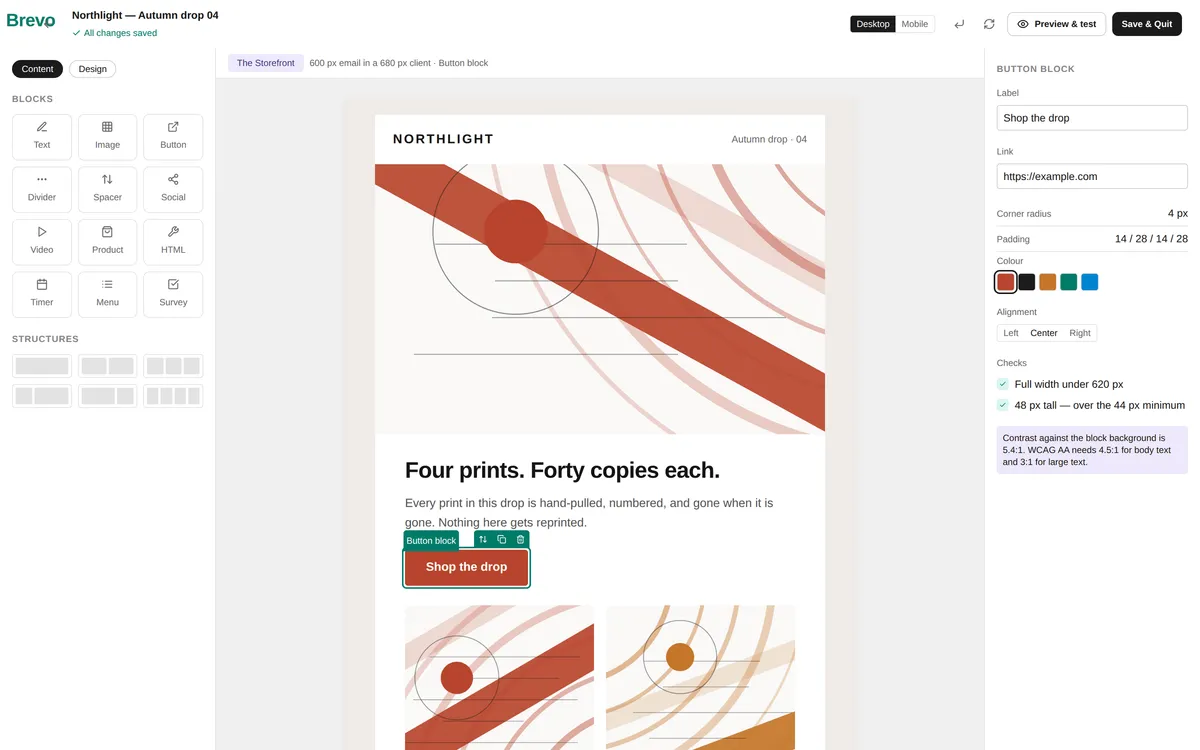
Every block in the left rail maps to something in the templates above. Text, Image, Button, Divider, Spacer for structure. Product for a storefront row. HTML for anything the editor does not model — which is how The Brief's chart is built:
A chart with no image in it
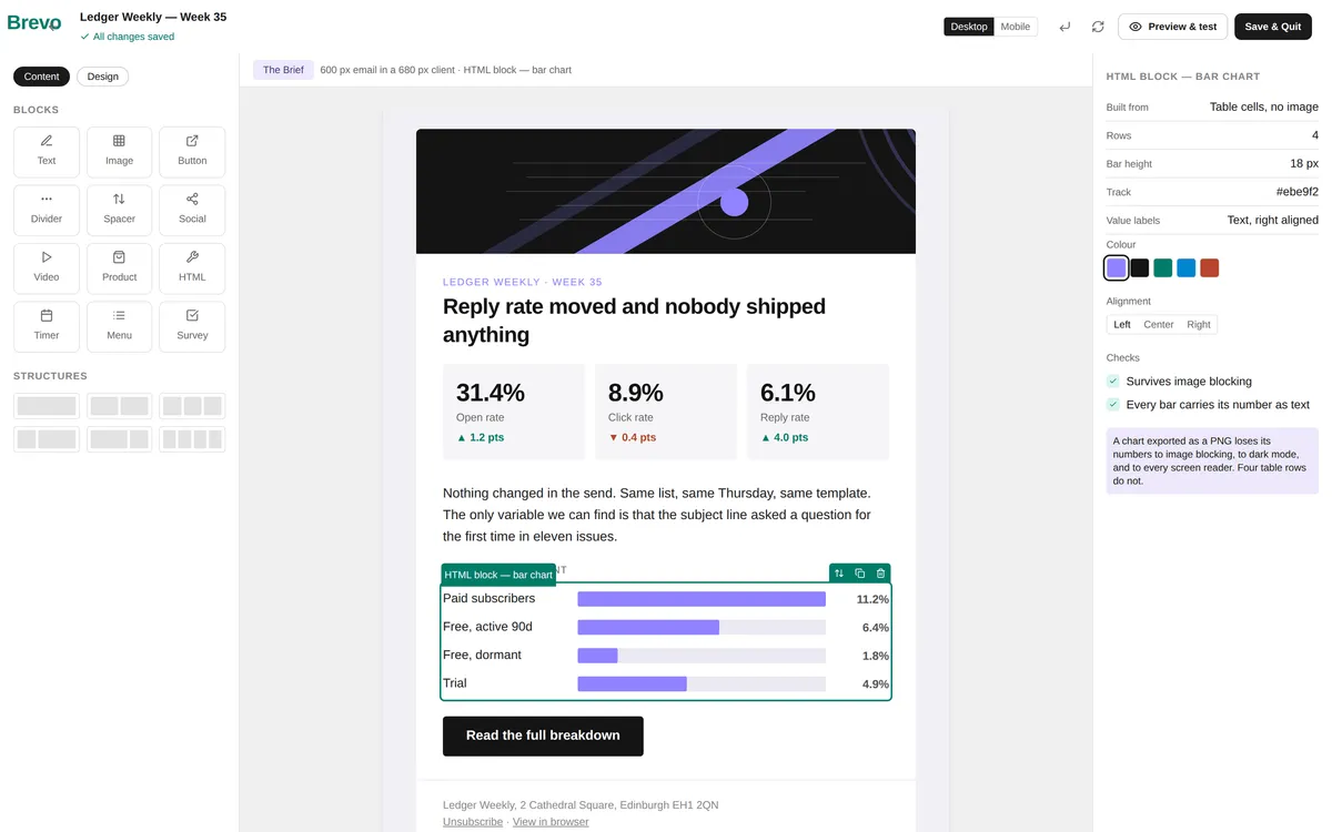
Typography works the same way. Select a text block and the panel gives you the font, the size, the line height and the padding — which is the entire toolkit the Letter needs:
A pull quote is a text block with a left border
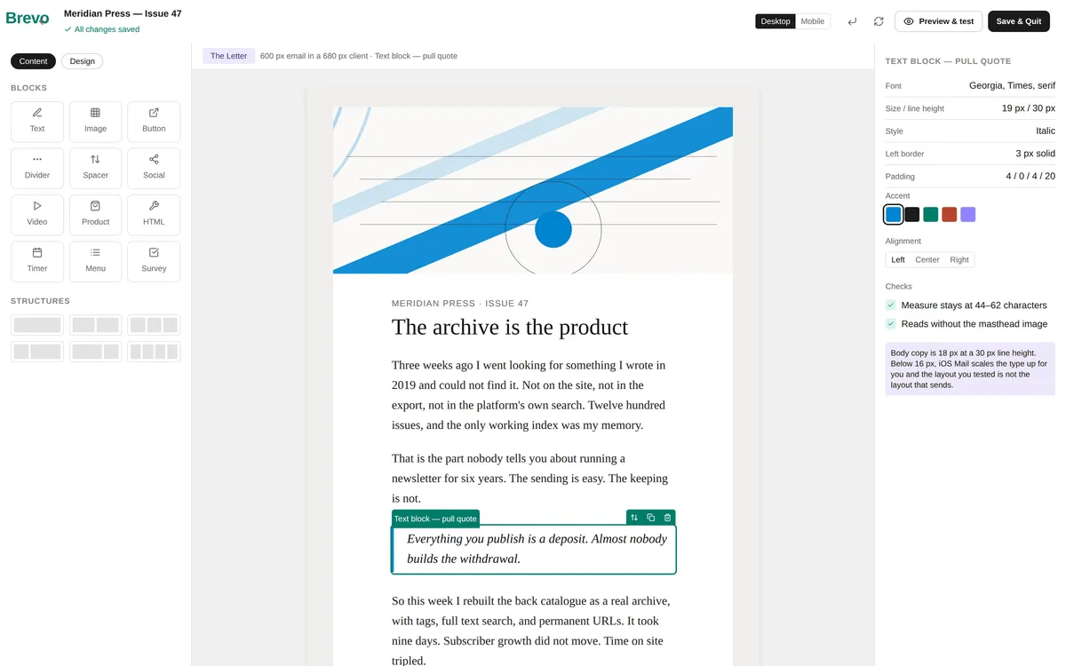
And images carry their own panel, where the alt text sits at the top rather than at the bottom of a settings list:
Alt text is a field, not an afterthought
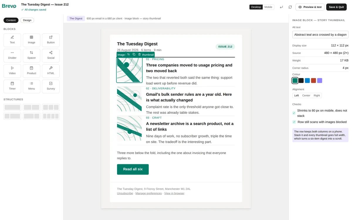
For businesses using Tajo, the same sections can be populated dynamically — product recommendations and personalized content driven by subscriber behavior, rendered into the blocks you laid out here rather than hand-picked per send.
Newsletter Design Fundamentals
Design Serves Content
The most important principle in newsletter design: design should make content easier to consume, never harder. Every design decision should answer the question: does this help my reader find and absorb the information they came for?
Signs of good newsletter design:
- Readers can scan the entire newsletter in 10-15 seconds
- The most important content is immediately visible
- Each section has a clear beginning and end
- The call-to-action stands out without being obnoxious
- The newsletter looks intentional, not accidental
Signs of poor newsletter design:
- Readers cannot find the main content quickly
- Multiple design styles compete for attention
- Text is difficult to read on any device
- The layout breaks on mobile screens
- Dense blocks of text with no visual breaks
The Visual Hierarchy Principle
Visual hierarchy controls the order in which readers process information. In newsletters, establish hierarchy through:
| Hierarchy Level | Element | Design Treatment |
|---|---|---|
| Primary | Main headline | Largest font, bold, top position |
| Secondary | Section headers | Medium font, contrasting color |
| Tertiary | Body content | Standard font, readable size |
| Supporting | Metadata (dates, authors) | Smaller font, lighter color |
| Action | CTA buttons/links | Contrasting color, button styling |
Layout Strategies
Single-Column Layout
The single-column layout is the gold standard for newsletters and the recommended approach for most publishers.
Advantages:
- Renders perfectly on every device and screen size
- Creates a natural reading flow from top to bottom
- Simplifies design decisions
- Reduces rendering issues across email clients
- Matches how people read on mobile (vertical scrolling)
Best for: Text-focused newsletters, personal newsletters, educational content, long-form analysis
Working example: The Letter, above. Note that it does not use the full 600 px for text — the measure is about 55 characters, and the 88 px gutters exist to hold it there.
Structure:
- Header (logo, issue number, date)
- Introduction or personal note
- Main content section
- Secondary content sections (separated by dividers)
- CTA or engagement prompt
- Footer
Card-Based Layout
Organize content into distinct visual cards, each with its own border, background, or shadow.
Advantages:
- Clear content separation
- Works well for curated content and link roundups
- Each card can have its own image and CTA
- Visually engaging without being overwhelming
Best for: Content roundups, curated links, product showcases, multi-topic newsletters
Working examples: The Digest and The Storefront, above. The Digest keeps its cards as full-width rows and never stacks them; The Storefront runs a genuine 2-up grid that collapses to one column under 620 px. Same archetype, opposite mobile behaviour, and the difference is whether the second column is a thumbnail or a product.
Design tips for cards:
- Use consistent card dimensions and spacing
- Keep 2 cards per row maximum (stack to 1 on mobile)
- Include a subtle border or background color to define cards
- Maintain consistent padding inside each card
Hybrid Layout
Combine a primary content column with a narrower sidebar for supplementary content.
Advantages:
- Fits more content without increasing email length
- Works for newsletters with both primary and secondary content
- Familiar format from traditional publications
Limitations:
- Must collapse to single column on mobile
- More complex to build and maintain
- Can feel cluttered if not well-organized
Best for: Company newsletters, media-style publications, content-heavy formats
Typography for Newsletters
Typography is the most impactful design element in any text-heavy email. Get fonts right, and everything else falls into place.
Font Selection
Email clients have limited font support. Use web-safe fonts as your primary choice:
| Font | Style | Best For |
|---|---|---|
| Arial | Clean, modern sans-serif | General purpose, business |
| Helvetica | Refined sans-serif | Premium brands |
| Georgia | Elegant serif | Editorial, long-form |
| Times New Roman | Classic serif | Traditional, formal |
| Verdana | Wide, readable sans-serif | Small text, mobile |
| Trebuchet MS | Modern sans-serif | Creative, casual |
Web fonts: You can specify web fonts (like Open Sans or Lato) with web-safe fallbacks. They render in Apple Mail, iOS Mail, and some Android clients, but fall back to the safe alternative in Outlook and older Gmail.
Font Sizing
| Element | Minimum Size | Recommended Size |
|---|---|---|
| Body text | 14px | 16px |
| Section headers | 20px | 22-24px |
| Main headline | 24px | 28-32px |
| Captions/metadata | 12px | 13-14px |
| CTA button text | 14px | 16px |
| Preheader text | 12px | 14px |
Line Spacing and Readability
- Line height: 1.4-1.6 for body text (24-26px at 16px font size)
- Paragraph spacing: 16-24px between paragraphs
- Line length: 50-75 characters per line (prevents eye fatigue)
- Letter spacing: Default for body text, slightly increased for small text
Text Formatting
- Bold: Use for key phrases and emphasis, not entire paragraphs
- Italic: Use sparingly for quotes, titles, or subtle emphasis
- Underline: Reserve exclusively for links (underlined non-link text confuses readers)
- ALL CAPS: Use only for short labels or buttons, never for body text
- Color: Use one accent color for links, keep body text dark gray (#333) or near-black
Color Strategy
Building a Newsletter Color Palette
Limit your newsletter to 3-4 colors:
| Color Role | Usage | Example |
|---|---|---|
| Primary | Headers, CTA buttons, accents | Brand blue |
| Text | Body copy, subheaders | Dark gray (#333333) |
| Background | Email body | White (#FFFFFF) or light gray (#F5F5F5) |
| Accent | Links, highlights, secondary CTAs | Brand secondary color |
Color Accessibility
- Maintain a minimum 4.5:1 contrast ratio between text and background
- Do not rely on color alone to convey information
- Test your palette with color blindness simulators
- Ensure links are distinguishable from regular text (use underlines, not just color)
Dark Mode Considerations
Many email clients now default to dark mode. Design with dark mode in mind:
- Avoid pure white (#FFFFFF) backgrounds — use slight off-white (#FAFAFA)
- Do not use transparent PNGs with dark elements (they disappear in dark mode)
- Test logos on both light and dark backgrounds
- Add meta tags for dark mode color scheme support
- Use borders or outlines on dark images so they remain visible
Image Usage in Newsletters
When to Use Images
Images should add value that text alone cannot provide:
- Product photography: Show products in context
- Data visualization: Charts, graphs, and infographics
- Screenshots: Demonstrate tools, features, or processes
- Headshots: Build personal connection with authors or team
- Illustrations: Support brand personality and tone
Image Optimization
| Specification | Recommendation |
|---|---|
| Format | JPEG for photos, PNG for graphics |
| Width | 600px standard, 1200px for retina |
| File size | Under 200KB per image |
| Total email size | Under 100KB excluding images |
| Alt text | Descriptive, 125 characters or less |
| Aspect ratio | 2:1 for hero images, 1:1 for thumbnails |
Image-to-Text Ratio
Maintain a healthy text-to-image ratio to avoid spam filters and ensure readability:
- Text-first by default unless the newsletter’s job requires visual merchandising
- Emails that are primarily images (image-only emails) have higher spam rates
- Always include text versions of key information, not just in images
- Design for image-blocked clients: your newsletter should make sense without images
Mobile-First Newsletter Design
Mobile Design Requirements
Because many subscribers read newsletters on phones, mobile design is not optional.
Mobile layout rules:
- Maximum content width: 600px (displays well on all devices)
- Minimum tap target: 44x44 pixels for buttons and links
- Minimum font size: 16px for body text on mobile
- Single column layout that stacks naturally
- Full-width CTA buttons on mobile
- Adequate spacing between clickable elements (prevent accidental taps)
Responsive Design Techniques
| Technique | Desktop | Mobile |
|---|---|---|
| Multi-column sections | Side by side | Stacked vertically |
| Images | Sized within content | Full width, scaled |
| Navigation links | Horizontal | Stacked or hidden |
| CTA buttons | Inline or right-aligned | Full width |
| Font sizes | Standard | Slightly larger |
| Padding | 20-40px | 15-20px |
Testing Mobile Rendering
Test your newsletter design on:
- iPhone (Safari/Mail)
- Android (Gmail app)
- iPad
- Gmail (web)
- Outlook (desktop and web)
- Apple Mail (desktop)
Use tools like Litmus or Email on Acid for automated rendering tests across 90+ email clients.
Designing Newsletter Sections
The Header
Your header establishes identity and sets expectations:
- Logo: Sized appropriately (not too large, typically 150-200px wide)
- Issue identifier: Issue number, date, or edition name
- View online link: For subscribers who have rendering issues
- Keep it compact: The header should not push content below the fold
Section Dividers
Clear dividers between content sections help readers scan:
- Horizontal rules: Simple, thin lines (1-2px) in a neutral color
- Background color changes: Alternate between white and light gray sections
- Extra spacing: 30-40px of padding between sections
- Section headers: Bold, larger text with consistent styling
The Footer
A well-designed footer completes the experience:
- Unsubscribe link (legally required, make it easy to find)
- Social media links
- Physical mailing address (CAN-SPAM requirement)
- View in browser link
- Forward to a friend option
- Brief brand tagline or mission statement
Newsletter Design Tools
Platform Editors
Most newsletter platforms include built-in design editors:
| Platform | Editor Type | Design Flexibility | Template Library |
|---|---|---|---|
| Brevo | Drag-and-drop | High | 40+ templates |
| Mailchimp | Drag-and-drop | High | 100+ templates |
| ConvertKit | Simplified editor | Moderate | Limited |
| Substack | Text-focused | Low | Minimal |
Brevo’s drag-and-drop editor makes professional newsletter design accessible without coding knowledge, and every block in its left rail maps to something in the four templates above.
Design Resources
- Canva: Create newsletter header images, social graphics, and illustrations
- Unsplash/Pexels: Free stock photography
- Really Good Emails: Inspiration gallery of well-designed emails
- MJML: Open-source email framework for custom designs
- Figma: Design custom newsletter templates with email plugin exports
Newsletter Design Checklist
Before sending any newsletter, verify:
Layout:
- Single-column layout or properly responsive multi-column
- Content width is 600px or less
- Clear visual hierarchy from header to footer
- Sections are clearly separated
Typography:
- Body text is 16px or larger
- Line height is 1.4-1.6
- Headers create clear content structure
- Link text is descriptive (not “click here”)
Images:
- All images have alt text
- Images are optimized for file size
- Newsletter is readable without images
- Retina images provided for high-DPI displays
Mobile:
- Tested on iPhone and Android
- CTA buttons are full width on mobile
- Font sizes are readable on small screens
- Tap targets are 44px minimum
Accessibility:
- Color contrast meets 4.5:1 ratio
- Content is structured with proper headings
- No information conveyed by color alone
- Screen reader compatible
Brand:
- Colors match brand palette
- Logo is correctly sized and positioned
- Tone and voice are consistent with brand
- Footer includes all required legal elements
Evolving Your Newsletter Design
Newsletter design is not a one-time project. Evolve your design based on performance data and subscriber feedback:
- Track scroll depth: Are readers making it to the bottom of your newsletter?
- Monitor click maps: Which sections get the most clicks? Promote similar content.
- Survey subscribers: Ask about design preferences annually
- A/B test layouts: Compare card vs. linear layouts, image placement, and CTA styles
- Review competitors: Study what works in successful newsletters in your space
Strong newsletter design is almost invisible. Subscribers do not notice the design — they notice the content. That means the design is doing its job: removing friction, guiding attention, and making the reading experience effortless.
Start simple, stay consistent, and refine based on data. Your newsletter design should evolve with your audience, not ahead of it.